

4 Beispiele für Vertriebs-Dashboards, die 2025 eingeführt werden sollten
Vertriebs-Dashboard-Software kann Ihnen helfen, einen klaren und zentralen Überblick über wichtige Vertriebsdaten zu erhalten, um die Leistung zu überwachen, Trends zu erkennen und fundierte Entscheidungen zu treffen.

Auf dieser Seite
Ein klarer, dynamischer Überblick über Ihre Vertriebsleistung mit Hilfe von Vertriebs-Dashboard-Software kann für den Vertriebserfolg entscheidend sein. Die Visualisierung und Analyse der wichtigsten Vertriebskennzahlen an einem zentralen Ort über eine benutzerfreundliche Plattform verändert nicht nur die Art und Weise, wie der Vertriebsprozess abläuft, sondern verwandelt die Rohdaten in umsetzbare Erkenntnisse und gibt den Mitarbeitern einen klaren Überblick über die Vertriebsleistung.
Nehmen Sie Ford Motors als Beispiel. Bei Ford1gab es verschiedene Abteilungen mit unterschiedlichen Kundendaten, was es schwierig machte, die Bedürfnisse der Kunden zu verstehen. Im Jahr 2022 reorganisierte Ford daher das Unternehmen und richtete separate Geschäftsbereiche ein, um die verschiedenen Bereiche zu verwalten. Es wurde jedoch eine eigene Abteilung, Ford Pro, geschaffen, die sich um gewerbliche und staatliche Kunden kümmert. Um den Erfolg dieser Umstrukturierung sicherzustellen, musste Ford jedoch die interne Einheit verbessern.
Das Fehlen einer zentralisierten, gemeinsam genutzten Kundendatenbank behinderte die Fähigkeit von Ford, starke, langfristige Kundenbeziehungen aufzubauen. Ford verbrachte vier Monate mit der Implementierung eines neuen Systems, der Salesforce Platform, die mit einer integrierten Dashboard-Software für die Vertriebsanalyse ausgestattet ist, um alle Kundendaten zu zentralisieren.
Mit Hilfe von CRM Analytics wurde ein Dashboard erstellt, um zu verfolgen, wie gut die Umstellung funktioniert. Dabei wurden Bereiche wie die Kundeninteraktion, die Reduzierung unnötiger Anrufe und die Verwaltung von Marketingkampagnen untersucht. Innerhalb kürzester Zeit stellte Ford fest, dass die Klickraten bei E-Mails um 48 % gestiegen sind und dass die Pflege von Kampagnen vier Tage weniger in Anspruch nimmt.Ein solches Ergebnis lässt sich mit Hilfe vonCompass. Dabei handelt es sich um eine Software für das Management von Verkaufsanreizen, die es Unternehmen ermöglicht, ihre Verkaufsteams über ein automatisiertes Dashboard zu motivieren, das einen Echtzeitüberblick über die Leistung und die Provisionsinformationen bietet.
Dies unterstreicht die Bedeutung von Dashboard-Software für den Vertrieb und zeigt, dass ein Unternehmen jeder Größenordnung eine solche Software benötigt, um die Vertriebspipeline effektiv zu steuern. In diesem Blog werden die Gründe erörtert, warum Dashboards für die Vertriebsanalyse so wichtig sind und wie sie Ihnen helfen können, Ihr Unternehmen zum Erfolg zu führen.
Was ist eine Dashboard-Software für den Vertrieb?
Um die Software für das Vertriebs-Dashboard zu verstehen, müssen wir wissen, wofür das Vertriebs-Dashboard steht. Es bezieht sich auf eine visuelle Darstellung von Vertriebskennzahlen, so dass die Vertriebsmitarbeiter auf die Daten in Bezug auf den Fortschritt bei der Erreichung der Vertriebsziele zugreifen können.
Die visuelle Darstellung kann in Form eines Diagramms oder einer Tabelle erfolgen, aus der leicht ersichtlich wird, wo die Vertriebsteams gute Leistungen erbringen und wo sie sich verbessern müssen.Nach Angaben vonSalesforcekann ein optimiertes CRM mit einem integrierten Dashboard für die Vertriebsanalyse 44 % mehr Leads und 37 % mehr Umsatz bringen.
Die Software für das Vertriebs-Dashboard hingegen ist ein Werkzeug, das die Vertriebsdaten visuell organisiert und präsentiert. Sie können das Tool in Ihr CRM integrieren, um die Effizienz zu verbessern. Es ermöglicht den Benutzern, wichtige Vertriebskennzahlen schnell zu verstehen und zu analysieren. Wenn diese Software richtig integriert und eingesetzt wird, kann sie:
- Verbessern Sie die Sichtbarkeit. Sie können auf eine klare und übersichtliche Ansicht der wichtigsten Verkaufsmetriken zugreifen.
- Helfen Sie bei datengesteuerten Entscheidungen. Eine Vertriebs-Dashboard-Software kann Manager befähigen, datengestützte Entscheidungen zur Verbesserung der Vertriebsstrategien zu treffen.
- Optimieren Sie die Vertriebsleistung. Analytische Dashboards für den Vertrieb vereinfachen die Verfolgung der Leistung von Einzelpersonen und Teams und ermöglichen ein besseres Coaching und die Festlegung von Zielen.
- Steigern Sie die Effizienz der Mitarbeiter, die sie nutzen. Dashboards automatisieren die Datenerfassung und Berichterstattung. Das spart Zeit und verringert das Risiko von Fehlern.
- Und schließlich die Verkaufsleistung steigern. Dateneinblicke aus Dashboards können genutzt werden, um verbesserungswürdige Bereiche zu identifizieren und die Vertriebsaktivitäten für bessere Ergebnisse zu optimieren.
Laut HubSpot'sBericht über Vertriebstrends 2024haben Tools für das Vertriebsmanagement und die Vertriebsproduktivität mit 27 % bzw. 25 % den höchsten ROI.
Die Zahlen sprechen dafür, dass sich die Integration von Vertriebs-Dashboard-Software noch weiter lohnt. Eine solche Software hat das Potenzial, den Verkaufsprozess für die einzelnen Vertriebsmitarbeiter erheblich zu beschleunigen. Lassen Sie uns näher darauf eingehen, warum das Vertriebsteam diese Software benötigt.
Was macht ein gutes Vertriebs-Dashboard aus?
Ein gutes Vertriebs-Dashboard sollte einfach zu bedienen sein und wertvolle Erkenntnisse liefern. Um ein effektives Dashboard zu erstellen, sollten Sie sich auf Ihre Zielgruppe konzentrieren und die richtigen Vertriebs-KPIs auswählen. Stellen Sie sich diese Fragen, bevor Sie beginnen:
1. Wer ist Ihre Zielgruppe?
Bestimmen Sie, wer das Dashboard nutzen soll. Handelt es sich um eine Vertriebsleitung, einen Manager oder einen Vertriebsmitarbeiter? Wenn Sie Ihre Zielgruppe kennen, können Sie entscheiden, welche Vertriebs-KPIs Sie aufnehmen wollen.
2. Auf welche Vertriebs-KPIs sollten Sie sich konzentrieren?
Ein gutes Dashboard für die Vertriebsvergütung sollte die wichtigsten Kennzahlen hervorheben. Konzentrieren Sie sich auf wichtige Daten wie vierteljährliche Prognosen, Quotenerfüllung und Umsatzwachstum. Vermeiden Sie es, das Dashboard mit zu vielen Kennzahlen zu überfrachten, da dies zu Verwirrung führen kann.
3. Ist Ihr Dashboard mit Echtzeitdaten verbunden?
Stellen Sie sicher, dass das Dashboard Daten aus einer zuverlässigen Quelle bezieht, die von Ihrem Vertriebsanalyseteam verwaltet wird. Legen Sie außerdem fest, wie oft das Dashboard aktualisiert werden soll, um genaue Erkenntnisse zu liefern.
4. Wie werden Sie das Dashboard weitergeben?
Entscheiden Sie, wie die Menschen auf das Dashboard zugreifen werden. Können sie sich für regelmäßige Aktualisierungen anmelden? Wird es in einem CRM oder einem internen Portal verfügbar sein?
Mit der besten Dashboard-Software können Sie effektive Vertriebsberichte erstellen. Mit einem Tool wie Tableau können Sie ganz einfach ein Sales 360-Dashboard erstellen, das allen Teams dient. Benutzer können automatische Warnmeldungen für wichtige Ereignisse einstellen, z. B. das Erreichen von Verkaufsquoten oder Umsatzzielen. Eine gut konzipierte Dashboard-Software für den Vertrieb hält die Vertriebsleiter auf dem Laufenden und ermöglicht ihnen, sich auf die großen Ziele zu konzentrieren.
4 Beispiele für Vertriebs-Dashboards, die Sie implementieren müssen
1. Dashboard zur Verkaufsleistung
Ein Dashboard für die Vertriebsleistung gibt Ihnen einen vollständigen Überblick über das Engagement der Nutzer, die Erträge und die allgemeinen Vertriebskennzahlen. Es hilft Vertriebsteams, ihre Fortschritte zu verfolgen, Prognosen zu vergleichen und datengestützte Entscheidungen zu treffen. Compass, eine ICM-Software mit Leaderboard- und Scorecard-Funktionen, bietet diese Einblicke, um Unternehmen bei der Optimierung ihrer Vertriebsstrategien zu unterstützen.
Wichtige Widgets:
- Benutzerzugriff: Zeigt an, wie viele Nutzer das Compass oder die mobile App innerhalb eines bestimmten Zeitraums besucht haben. Dies hilft bei der Analyse von Engagement und Reichweite.
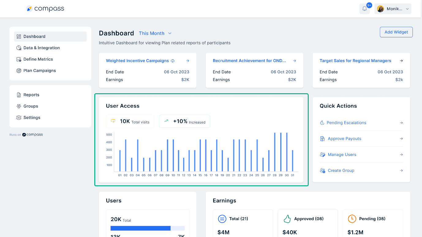
- Schnelle Aktionen: Ermöglicht den schnellen Zugriff auf wichtige Funktionen wie Auszahlungsgenehmigungen, Benutzerverwaltung und Gruppenbildung in Compass.
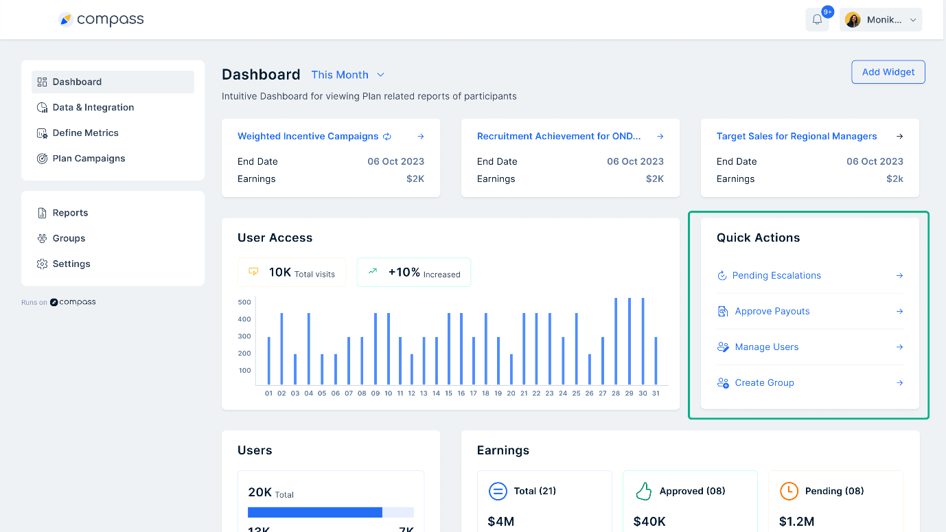
- Benutzer und Quote: Zeigt Benutzer an, die Meilensteine erreicht haben (berechtigt) und solche, die dies nicht getan haben (nicht berechtigt). Außerdem werden Details zur Quotenerfüllung angezeigt.
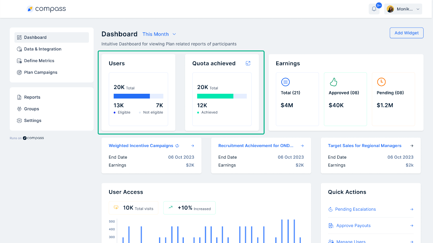
- Verdienst: Bietet eine Übersicht über die Gesamteinnahmen, ausstehende Genehmigungen und abgelehnte Zahlungen und sorgt so für Transparenz bei den Provisionen.
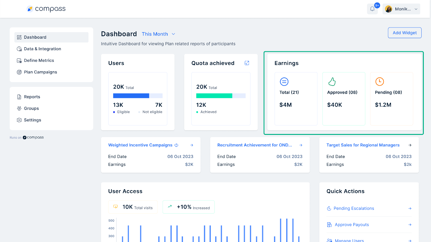
Am besten geeignet für: Vertriebsanalysten und Manager, die einen strukturierten Überblick über Benutzeraktivitäten und -einnahmen benötigen.
Wann zu verwenden: Ideal, um die tägliche oder wöchentliche Verkaufsleistung zu verfolgen und mit Compass fundierte Entscheidungen zu treffen.
2. Dashboard zur Umsatzvergütung
Mit einem Dashboard für die Vertriebsvergütung können Unternehmen verfolgen, wie Provisionen und Anreize verteilt werden. Es gewährleistet eine faire und transparente Auszahlung. Compass vereinfacht diesen Prozess, indem es klare Einblicke in Vergütungstrends bietet.
Wichtige Widgets:
- Auszahlungstrends planen: Hilft zu verstehen, wie die Nutzer monatlich, vierteljährlich oder jährlich bezahlt werden. Hebt ungewöhnliche Trends bei den Auszahlungen hervor.
- Investitionen und Einnahmen: Vergleicht die Investitionen in Anreize mit den erzielten Einnahmen. Dies hilft bei der Bewertung des ROI.
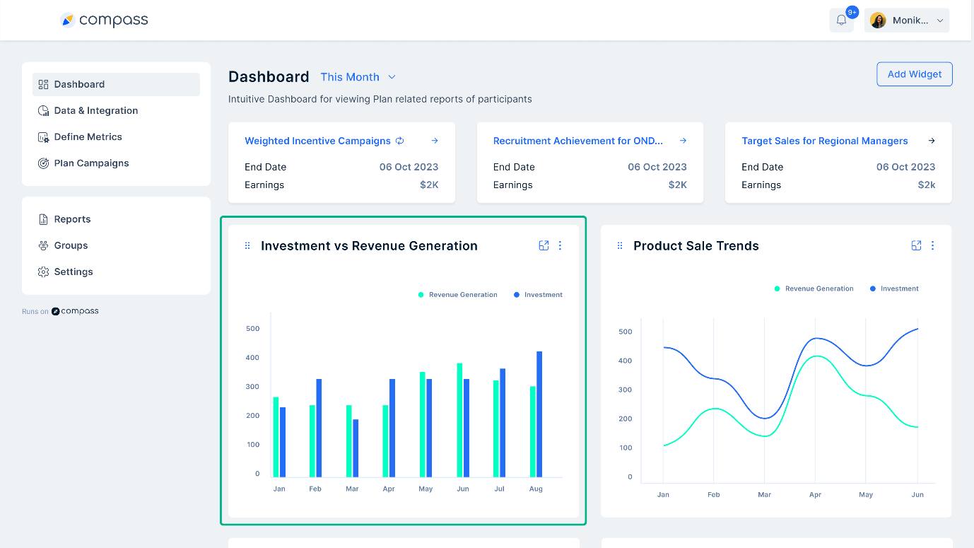
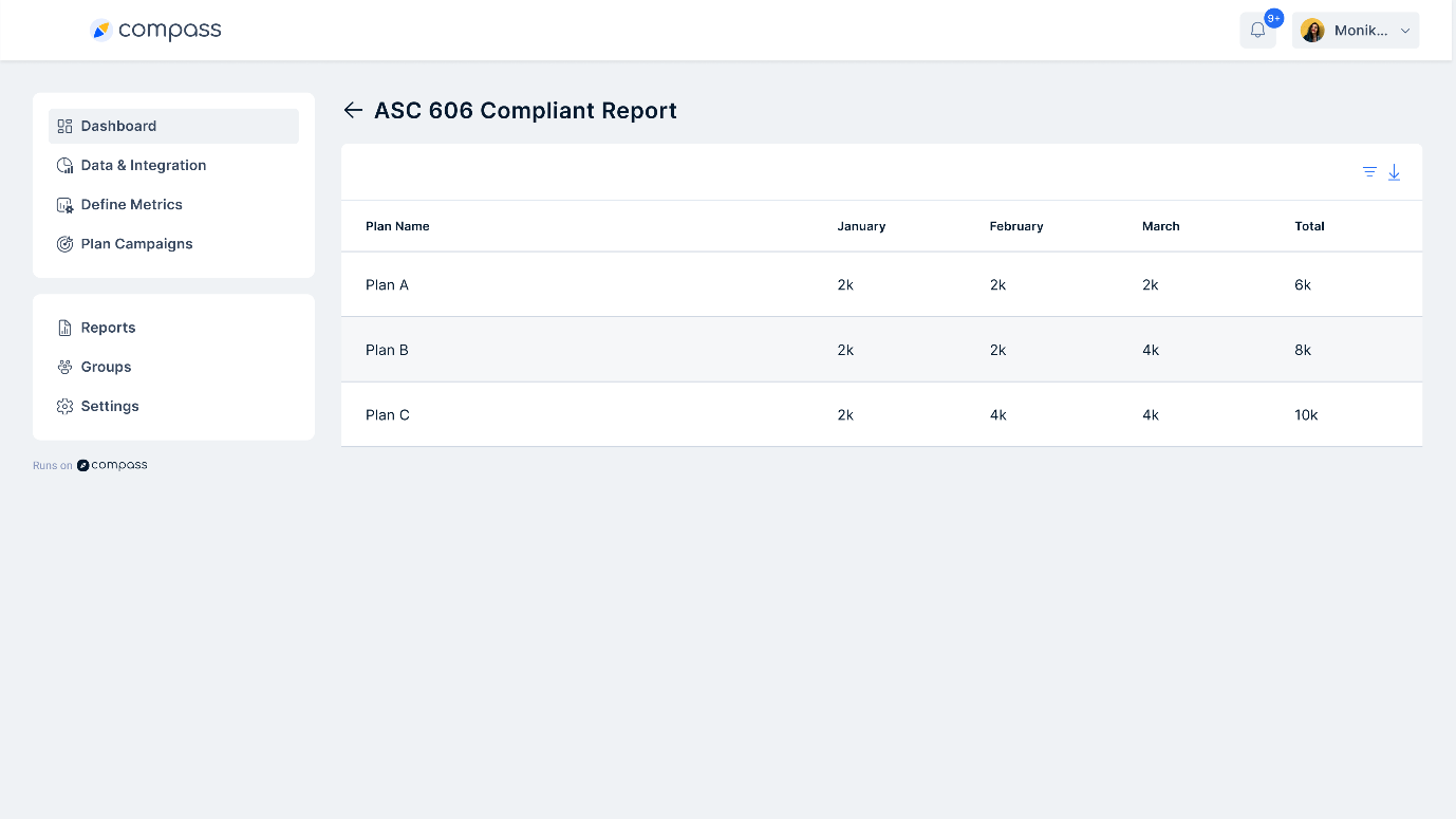
- ASC 606-Erstellung: Stellt sicher, dass alle Provisions- und Incentive-Pläne den Vorschriften wie ASC 606 und IFRS 15 entsprechen - ein wichtiges Merkmal von Compass.
Am besten geeignet für: Vertriebsleiter und Finanzteams, die Provisionsstrukturen verwalten.
Wann zu verwenden: Nützlich für die Analyse von Vergütungstrends und die Anpassung von Provisionsplänen mit Compass.
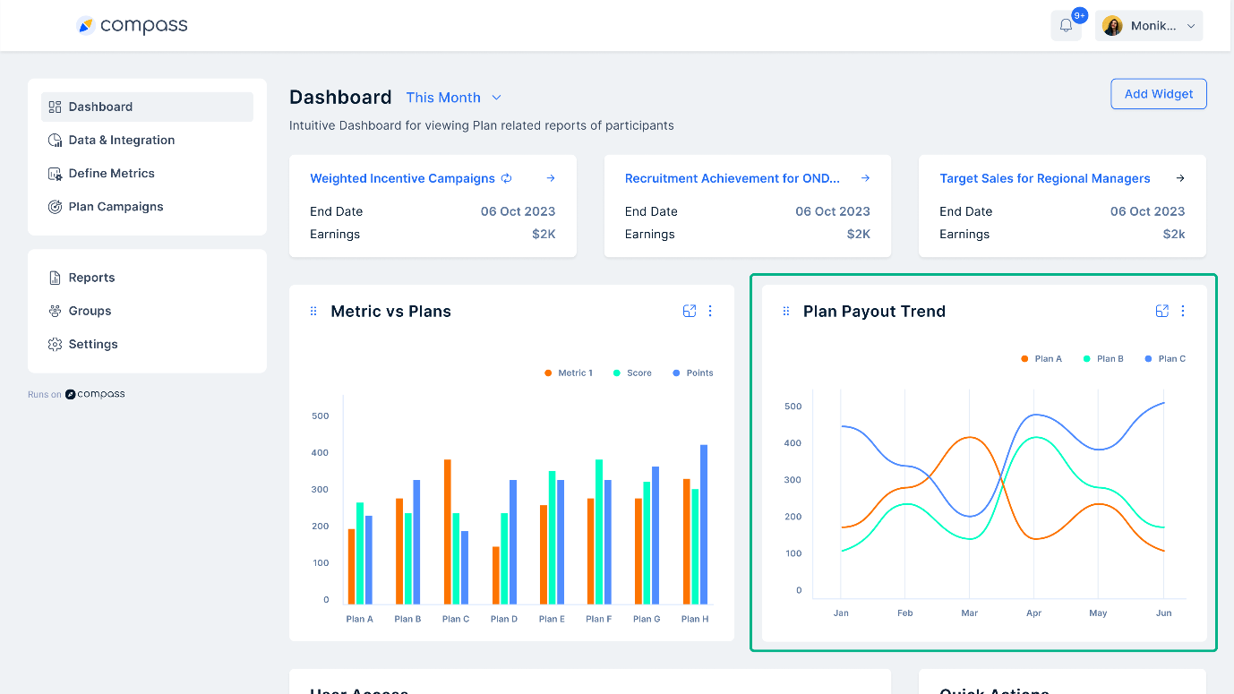
3. Sales 360 Dashboard
Ein Sales 360 Dashboard bietet einen vollständigen Überblick über Verkaufstrends, Ranglisten und ROI-Berechnungen. Compass bietet diese Einblicke, um Unternehmen dabei zu helfen, Produktverkaufsmuster und Benutzerleistung zu verstehen.
Wichtige Widgets:
- Produktverkaufstrends: Verfolgt die Entwicklung der Produktverkäufe im Laufe der Zeit. So können Unternehmen feststellen, welche Produkte beliebt sind und welche mehr Aufmerksamkeit erfordern.
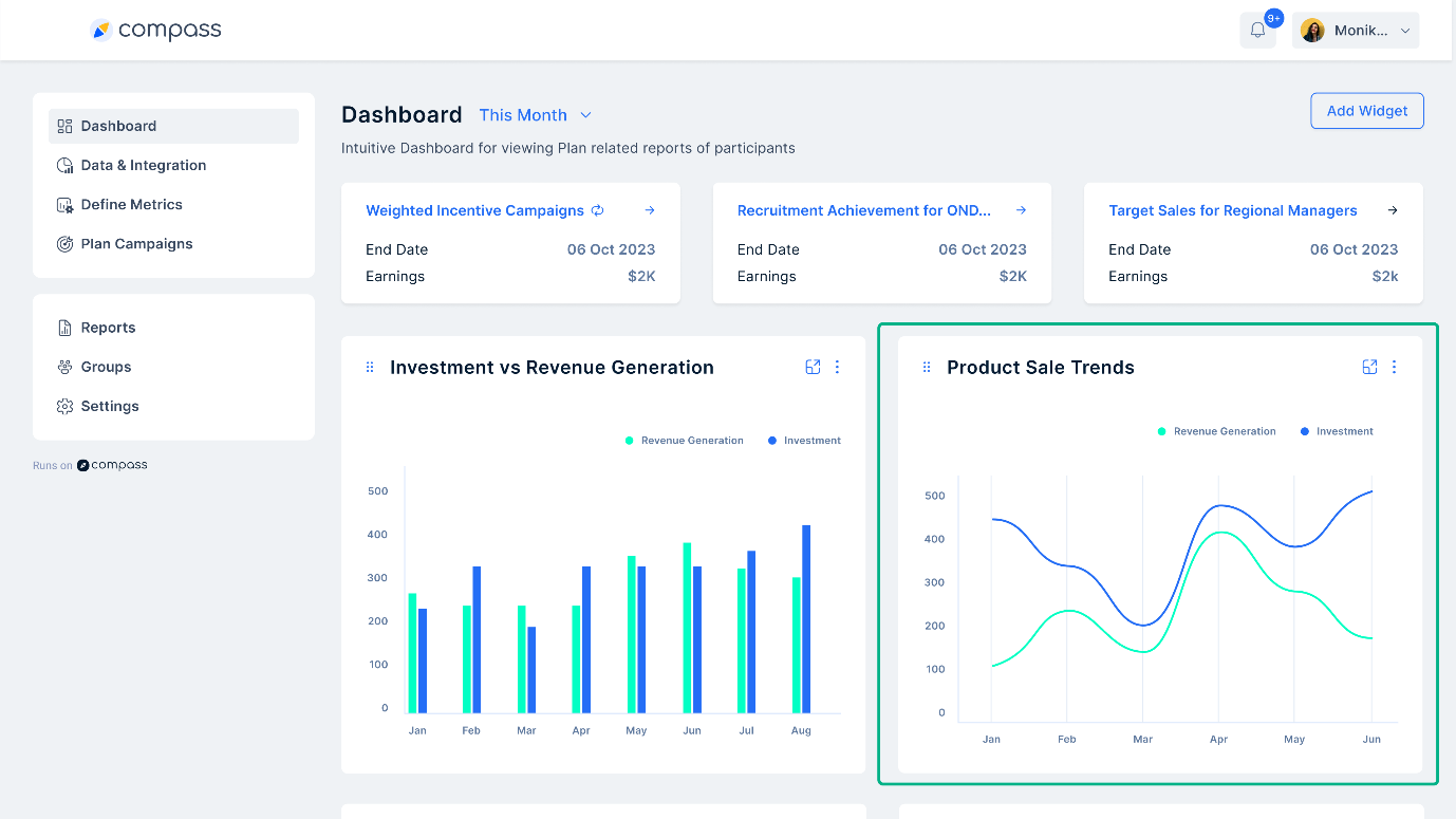
- Rangliste: Einstufung von Vertriebsmitarbeitern anhand von Leistungskennzahlen wie Umsatz und Verkaufsvolumen. Compass nutzt Leaderboards, um ein wettbewerbsorientiertes und motiviertes Vertriebsumfeld zu schaffen.
- Metrik gegen Pläne: Bietet Einblicke in die Leistung verschiedener Vertriebspläne im Vergleich zueinander. Admins können sie anpassen, um wichtige Leistungsindikatoren (KPIs) mit Compass zu verfolgen.
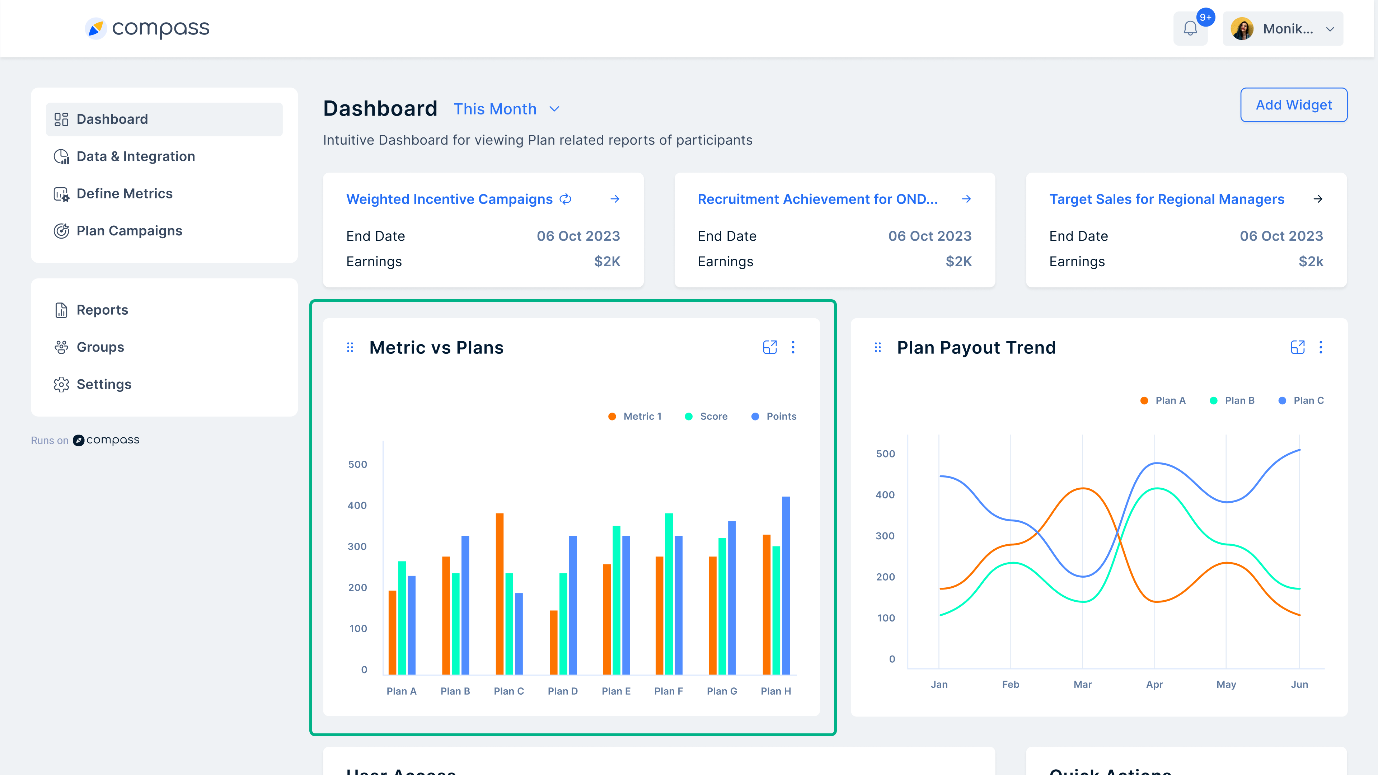
Am besten geeignet für: Vertriebsleiter und Führungskräfte, die einen vollständigen Überblick über die Vertriebsaktivitäten haben möchten.
Wann zu verwenden: Nützlich für den Vergleich von Vertriebsstrategien, die Überwachung der Leistung von Vertriebsmitarbeitern und die Festlegung künftiger Ziele mit Compass.
4. Dashboard für Verkaufsprovisionen
Ein Dashboard für Verkaufsprovisionen verfolgt die Einnahmen, die Leistung der Nutzer und die erreichten Quoten. Es hilft Administratoren bei der Verwaltung von Auszahlungen und der Sicherstellung einer fairen Vergütung durch die automatischen Tracking-Funktionen von Compass.
Wichtige Widgets:
- Verdienstübersicht: Zeigt die Gesamteinnahmen, ausstehende Genehmigungen und abgelehnte Zahlungen an.
- Leistungsbericht: Zeigt eine Momentaufnahme der Benutzerleistung über verschiedene Verkaufspläne hinweg. Kann angepasst werden, um bestimmte Benutzer oder Pläne zu filtern.
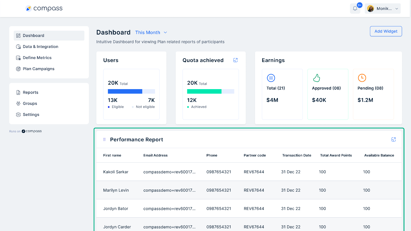
- Benutzer und Quote: Hebt Benutzer hervor, die ihre Quoten erfüllt haben, und solche, die noch darauf hinarbeiten.
Am besten geeignet für: Vertriebsleiter und Finanzteams, die für die Auszahlung von Provisionen zuständig sind.
Wann zu verwenden: Unerlässlich für die Verfolgung und Anpassung von Provisionsstrukturen auf der Grundlage der Verkaufsleistung mit Compass.
Warum brauchen wir eine Dashboard-Software für den Vertrieb?
Nach Angaben vonHubSpotsind bis zu 78 % der Vertriebsmitarbeiter der Meinung, dass ihr CRM die Ausrichtung des Vertriebs effektiv verbessert. Um den Effekt zu maximieren, sollten Sie jedoch eine Vertriebs-Dashboard-Software implementieren. Damit werden nicht nur wichtige Vertriebsdaten zentralisiert und visuell organisiert, sondern es entfällt auch die Notwendigkeit, Informationen aus verschiedenen Quellen zusammenzustellen. Stellen Sie sich vor, wie viel Zeit und Mühe Sie einsparen können, die Sie für administrative Aufgaben verwenden können. Das Dashboard ermöglicht es Ihnen,:
- Verfolgen Sie wichtige Metriken und KPIs:Mit der Vertriebs-Dashboard-Software können Unternehmen alle wesentlichen Leistungsindikatoren (KPIs) und Schlüsselkennzahlen (z. B. Konversionsraten, Lead-Generierung, Zustand der Vertriebspipeline) an einem Ort überwachen. Diese umfassende Ansicht ermöglicht eine fundierte Entscheidungsfindung und hilft bei der Identifizierung von Bereichen, die verbessert werden müssen.
- Verfolgung der Teamleistung:Sie können das Dashboard für die Vertriebsanalyse an Ihre Bedürfnisse anpassen, um die Leistung einzelner Teams und Vertriebsmitarbeiter zu verfolgen. Auf diese Weise können Manager Top-Performer identifizieren, Bereiche erkennen, in denen zusätzlicher Coaching-Bedarf besteht, und sicherstellen, dass alle an den allgemeinen Vertriebszielen ausgerichtet sind.
- Überwachung von Provisionen und Incentives:Die Dashboard-Software für den Vertrieb kann so konfiguriert werden, dass sie Provisionsstrukturen, den Fortschritt von Incentive-Kampagnen und die Verdienste einzelner Vertriebsmitarbeiter anzeigt. Diese Transparenz motiviert die Teams und fördert eine ergebnisorientierte Vertriebskultur.
Durch die Visualisierung von Daten in Echtzeit und die Bereitstellung von Einblicken ermöglicht die Sales Dashboard Software Unternehmen, ihre Vertriebsbemühungen zu optimieren und nachhaltiges Wachstum zu erzielen.
Wie kann man die Software für das Vertriebs-Dashboard nutzen, um das beste Ergebnis zu erzielen?
AStudie von Salesforcezeigt, dass datengesteuerte Strategien ein Schlüsselfaktor für den Erfolg sind: 79 % der leistungsstarken Vertriebsteams nutzen diesen Ansatz. Angesichts dieser aussagekräftigen Daten ist es offensichtlich, dass Vertriebsmitarbeiter einen strategischen Rahmen benötigen, um optimale Ergebnisse zu erzielen.
- Ermitteln Sie wichtige Leistungsindikatoren(KPIs): Bestimmen Sie die entscheidenden Kennzahlen, die den Erfolg Ihres Vertriebsteams widerspiegeln. Beispiele sind der erzielte Umsatz, die Konversionsrate und die Länge des Verkaufszyklus.
- Wählen Sie eine Dashboard-Software für den Vertrieb: Entscheiden Sie sich für eine Software, die sich in Ihre vorhandenen Datenquellen, z. B. Ihr CRM-System, integrieren lässt und Visualisierungen bietet, die Ihren Anforderungen entsprechen.
- Erstellen Sie Ihr Dashboard: Entwerfen Sie ein klares und übersichtliches Dashboard, das die von Ihnen gewählten KPIs anzeigt. Setzen Sie Prioritäten für die wichtigsten Kennzahlen, um sie besser sichtbar zu machen.
- Überwachen Sie die Leistung regelmäßig:Planen Sie regelmäßige Überprüfungen Ihres Vertriebsanalyse-Dashboards, um die Fortschritte bei der Erreichung Ihrer Ziele zu verfolgen und Bereiche mit Verbesserungsbedarf zu ermitteln.
- Ergreifen Sie umsetzbare Schritte:Nehmen Sie auf der Grundlage der Erkenntnisse aus dem Dashboard datengestützte Anpassungen an Ihren Vertriebsstrategien und -taktiken vor.
Was ist bei der Auswahl der besten Dashboard-Software zu beachten?
Eine Studie vonMcKinsey & Unternehmenaus dem Jahr 2022 ergab, dass die umfassende Nutzung von Daten in B2B-Verkaufsstrategien zu einer Umsatzsteigerung von bis zu 25 % führen kann. Die Auswahl der am besten geeigneten Dashboard-Software für den Vertrieb kann jedoch eine schwierige Aufgabe sein, da es eine Vielzahl von Tools gibt, die jeweils auf die spezifischen Bedürfnisse unterschiedlicher Geschäftsmodelle zugeschnitten sind. Im Folgenden finden Sie einige Schlüsselfaktoren, die Sie bei der Auswahl der für Ihre Bedürfnisse am besten geeigneten Dashboard-Software berücksichtigen sollten:
1. Kompatibilität der Datenquellen: Vergewissern Sie sich, dass die Software mit Ihren bestehenden Datenquellen, wie Datenbanken oder Marketingplattformen, verbunden werden kann.
2. Anpassung:Die Möglichkeit, Dashboards auf Ihre spezifischen Bedürfnisse zuzuschneiden und die wichtigsten Kennzahlen anzuzeigen, ist von entscheidender Bedeutung.
3. Datenvisualisierung:Achten Sie auf Software, die eine Vielzahl von klaren und leicht verständlichen Visualisierungsoptionen wie Diagramme und Grafiken bietet.
4. Skalierbarkeit:Überlegen Sie, ob die Software Ihr wachsendes Datenvolumen und Ihren künftigen Bedarf bewältigen kann.
5. Sicherheit:Die Software sollte die Datensicherheit in den Vordergrund stellen, um sensible Informationen zu schützen.
Fallstudien: Mahindra Finance: 40 % schnelleres Incentive-Management mit Compass Dashboard
Mahindra Finance ist ein bekanntes Nicht-Banken-Finanzunternehmen innerhalb der Mahindra-Gruppe, einem führenden indischen Unternehmen. Das Unternehmen ist auf das Angebot von Finanzdienstleistungen wie Fahrzeugdarlehen, Wohnungsbaudarlehen, Privatkredite und Versicherungen spezialisiert.
Mahindra Finance beschäftigt landesweit mehr als 20.000 Vertriebsmitarbeiter, die als Direktvertriebsteams eine wesentliche Rolle für den Erfolg des Unternehmens spielen. Allerdings bereitete die Verwaltung ihrer Provisions- und Anreizstrukturen erhebliche Schwierigkeiten. Dies führte zu weit verbreiteter Unzufriedenheit und betrieblichen Ineffizienzen.
Wofür benötigte Mahindra Finance Hilfe?
Mahindra Finance war unzufrieden und stellte Ineffizienzen bei den Mitarbeitern fest. Sie hatten ein fragmentiertes Datensystem. Die Verkaufsdaten waren über zahlreiche Plattformen verstreut. Dies führte zu Problemen beim Abruf, Ineffizienz und häufigem Datenverlust.
Die Kombination von Daten aus verschiedenen Quellen erwies sich als kompliziert und fehleranfällig. Infolgedessen verzögerte sich die Berechnung der Anreize. Es gab zahlreiche, auf verschiedene Regionen zugeschnittene Incentive-Pläne, die häufig aktualisiert und manuell angepasst werden mussten. Dieser Prozess erhöhte das Risiko von Fehlern.
Darüber hinaus waren zeitaufwändige Neuberechnungen aufgrund von Scheckverrechnungen und Prüfungsanforderungen fehleranfällig und es fehlte an Transparenz für die Mitarbeiter, was zu Verzögerungen bei der Auszahlung der Prämien führte. Um die Herausforderungen zu bewältigen, suchte das Unternehmen die Hilfe von Compass, einer Software für die Verwaltung von Verkaufsanreizen, um die Komplexität zu rationalisieren.
Welche Maßnahmen hat Compass ergriffen, um Mahinda Finance zu unterstützen?
Compass mehrere Implementierungsprozesse sorgfältig geplant und durchgeführt. Compass integrierte sein responsives Dashboard, um alle Datenquellen in einer einzigen, zentralen Plattform zu konsolidieren. Dadurch entfiel die Notwendigkeit, Daten von verschiedenen Standorten aus zu verwalten. Die Datenverarbeitung wurde automatisiert, um sowohl die Geschwindigkeit als auch die Genauigkeit zu erhöhen.
Darüber hinaus ermöglichten sie Mahinda Finance Echtzeitberechnungen, um sicherzustellen, dass die Berechnungen auf der Grundlage vorgegebener Regeln und Programme erfolgen und die Handelsvertreter pünktlich und genau bezahlt werden.
Compass bot Mahindra Finance genügend Flexibilität, um verschiedene Incentive-Programme für unterschiedliche Regionen und Produktlinien einfach zu aktualisieren und zu verwalten. Als vorteilhaft erwies sich die Hinzufügung des Dashboards, da es den Vertriebsmitarbeitern ermöglichte, ihre Leistung und die Berechnung der Anreize in Echtzeit zu verfolgen. Dies förderte das Vertrauen und verbesserte die Kommunikation.
Welche Veränderungen hat Mahindra Finance festgestellt?
Compass den Prozess der Verkaufsprovisionen automatisiert. Das Ergebnis war, dass Mahindra Finance es bemerkte,
- Die Zahl der Vertreter, die sich für Anreize qualifizierten, stieg um über 25 %.
- Berechnungsfehler wurden um über 98 % minimiert.
- Die Bearbeitungsgeschwindigkeit der Anreize wurde um über 99 % verbessert.
- Steigerung der Verkaufsleistung um 30 %.
- Verringerung des Zeitaufwands für die Verwaltung von Anreizen um 40 %.
Schlussfolgerung
Verschaffen Sie sich mit der Sales Dashboard Software einen klaren und zentralen Überblick über wichtige Vertriebsdaten. Überwachen Sie die Leistung, erkennen Sie Trends und treffen Sie fundierte Entscheidungen, um Ihre Vertriebsziele zu erreichen. Es gibt zwar viele Optionen, aber wir empfehlen Compass. MitCompasskönnen Sie:
- Verfolgen Sie Verkaufsleistung und Auszahlungen in Echtzeit.
- Greifen Sie auf erweiterte Analysen und Einblicke zu, indem Sie Filter hinzufügen und Trends nach Regionen, Teams und Programmen sofort erkennen.
- Generieren Sie fehlerfreie Bescheinigungen auf granularer Ebene.
- Verschaffen Sie sich einen Überblick über die Aspekte der Provisionen, einschließlich der in der Pipeline befindlichen Geschäfte, der angefallenen Provisionen, der Prognosen und mehr.
Erleichtern Sie sich die Analyse und Optimierung von Vertriebsstrategien mit Compass. Vereinbaren Sie jetzt einen Demo-Termin, um von unseren Experten zu erfahren, wie Sie einen zentralen Überblick über wichtige Vertriebskennzahlen erhalten und datengestützte Entscheidungsprozesse einleiten können.
FAQ's
Wie erstelle ich ein Dashboard für die Vertriebsleistung in Excel?
So erstellen Sie ein Dashboard zur Vertriebsleistung in Excel:
- Sammeln Sie Daten: Sammeln Sie Verkaufsdaten aus Ihren Quellen.
- Organisieren Sie Daten: Strukturieren Sie die Daten in einem klaren und logischen Format.
- Tabellen und Diagramme einfügen: Verwenden Sie die Diagrammwerkzeuge von Excel, um Visualisierungen zu erstellen.
- Pivot-Tabellen verwenden: Fassen Sie Daten mit Pivot-Tabellen zusammen und analysieren Sie sie.
- Entwerfen Sie das Layout: Ordnen Sie Diagramme und Tabellen so an, dass sie gut sichtbar sind.
- Interaktivität hinzufügen: Verwenden Sie Slicer und Filter, um das Dashboard interaktiv zu gestalten.
- Überprüfung und Aktualisierung: Regelmäßige Aktualisierung der Daten und Verfeinerung des Dashboards.
Was ist in einem Dashboard enthalten?
Ein Dashboard umfasst in der Regel:
- Schlüsselmetriken und KPIs: Die wichtigsten zu verfolgenden Datenpunkte.
- Visualisierungen: Diagramme, Schaubilder und Tabellen zur Darstellung von Daten.
- Filter und Steuerelemente: Optionen zum Anpassen der Ansicht und zum Aufschlüsseln von Daten.
- Datenquellen: Informationen darüber, woher die Daten stammen.
- Kontextuelle Informationen: Anmerkungen oder Erklärungen, die den Kontext liefern.
Was ist ein KPI-Dashboard?
Ein KPI-Dashboard (Key Performance Indicator) ist ein Werkzeug, das die wichtigsten Metriken und KPIs für ein Unternehmen visualisiert. Es hilft bei der Überwachung der Leistung im Vergleich zu den Zielen und beim Treffen datengestützter Entscheidungen.
Was sind die drei Arten von Dashboards?
Es gibt drei Arten von Dashboards:
- Operative Dashboards: Überwachen Sie Prozesse und Abläufe in Echtzeit.
- Analytische Dashboards: Analysieren Sie große Datenmengen, um Trends und Erkenntnisse zu ermitteln.
- Strategische Dashboards: Verfolgen Sie langfristige Unternehmensstrategien und -ziele.
Wie erstellt man ein Vertriebs-Dashboard?
Gehen Sie folgendermaßen vor, um ein Vertriebs-Dashboard zu erstellen:
- Definieren Sie Ihre Ziele: Legen Sie fest, was Sie mit dem Dashboard erreichen wollen.
- Identifizieren Sie Schlüsselkennzahlen: Wählen Sie die wichtigsten zu verfolgenden Vertriebskennzahlen aus.
- Daten sammeln: Sammeln Sie Daten aus Ihren Verkaufstools und Datenbanken.
- Wählen Sie ein Dashboard-Tool: Wählen Sie ein Tool wie Excel, Tableau oder Power BI.
- Gestalten Sie das Layout: Organisieren Sie das Dashboard so, dass es leicht lesbar ist.
- Daten visualisieren: Verwenden Sie Diagramme, Schaubilder und Tabellen zur Darstellung von Daten.
- Überprüfen und verfeinern: Kontinuierliche Aktualisierung und Verbesserung des Dashboards.